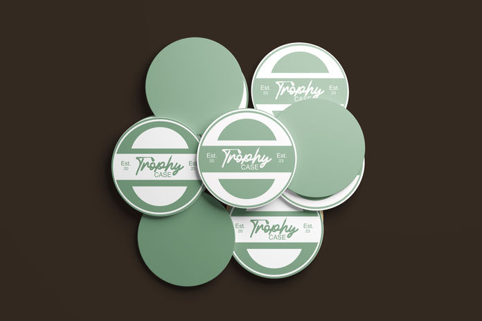
Trophy Case
Fall 2023 | Adobe Illustrator, Photoshop
 |  |  |
|---|
What is this project?
For my "Logo Blitz" assignment, I was tasked with designing a logo for a fictitious business based on a given brand descriptor and business category. Drawing from the "fancy" adjective and the sports bar category, I identified an opportunity for an upscale sports bar that would cater to customers seeking a more traditional, refined atmosphere, particularly for sports like tennis and golf. After conducting research, I developed the concept for "Trophy Case," a sports bar that combines elegance with the excitement of sports. The name "Trophy Case" carries multiple meanings: it represents pride in victories, it humorously references a bar's alcohol display, and it evokes the enthusiasm and pride associated with winning and supporting one’s team.
How did I prepare?
To prepare for the design, I researched the upscale sports bar market, paying particular attention to brands that offered a more sophisticated atmosphere. I also explored the visual identity of sports like tennis and golf to ensure the design would resonate with the target audience. This research helped me shape the brand identity, which was built on a balance of luxury, tradition, and the excitement of sports. I experimented with various fonts, color schemes, and symbols that conveyed these values, ensuring the design would feel both refined and energetic.
How did I put my plan into action?
For the design execution, I created two variations of the logo: one featuring a stylized trophy and the other using a more minimalistic emblem inspired by vintage sports logos. I also designed a one-color version to ensure flexibility across different applications. The color palette incorporated deep golds, blacks, and rich greens, reflecting the premium nature of the sports bar while tying in with the colors traditionally associated with tennis and golf. I selected elegant yet bold fonts, ensuring the logo was legible while maintaining a sense of refinement. To bring the concept to life, I included a mockup showing how the logo would appear on signage, menus, and promotional materials.
What were my results and lessons?
The final product was a brand identity that effectively captured the essence of the sports bar. My professor and peers praised the clarity and thoughtfulness of the design, noting how it successfully merged elegance with the vibrant energy of sports. The most challenging aspect was striking the right balance between the upscale aesthetic and the lively spirit of a sports bar. I overcame this by subtly incorporating elements of sports culture, such as the trophy motif, while keeping the design clean and sophisticated. This project taught me the importance of understanding both the target audience and the subtle nuances of brand identity, as well as the necessity of creating designs that are not only visually appealing but also deeply aligned with the business’s values and personality.


