Toujours
Spring 2024 | Adobe Illustrator, Photoshop, Dielines, Printing and Folding
 |  |  |  |
|---|---|---|---|
 |  |  |
What is this project?
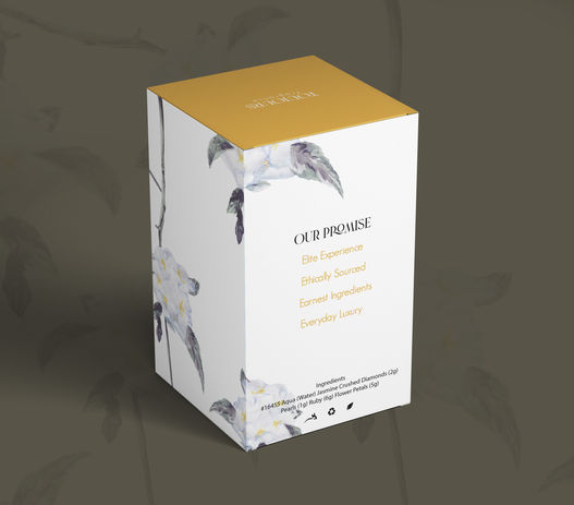
For this project, I was assigned to create a brand identity and package design for a fictional client, Luxurious Lupica, a persona developed by my professor. The goal was to design a product that would appeal to a young, luxurious female audience, and my task was to create a compelling visual identity that would resonate with this demographic. The design needed to embody the elegance and exclusivity of a luxury product, ensuring that it would stand out in the competitive market of high-end goods.
How did I prepare?
To inform my design decisions, I began by conducting thorough research into the target audience, focusing on demographics, psychographics, and consumer behaviors. I wanted to deeply understand the desires, preferences, and purchasing habits of young women who gravitate towards luxury items. I also researched successful luxury products, such as Dior perfumes and La Mer moisturizers, analyzing their design strategies to identify key elements that appeal to this market. Based on this research, I generated twenty iterations of package and logo designs for the fictional product, experimenting with different visual styles, color schemes, and symbols. After presenting these concepts, I received constructive feedback regarding composition and alignment with customer expectations, which guided me in refining my designs.
How did I put my plan into action?
In my competitive analysis, I noticed that many luxury brands favored minimalist and naturalistic designs, often incorporating artistic imagery to convey exclusivity and refinement. This insight inspired me to develop the primary imagery for the package, a watercolor painting of a bushel of flowers. I created the painting by hand and then enhanced it digitally using Adobe Photoshop. I integrated the artwork into the packaging die lines, experimenting with various compositions to find the most visually striking layout. To better visualize how the product would appear in a retail environment, I printed and folded the die lines, ensuring that the packaging would be aesthetically appealing on store shelves.
What were my results and lessons?
After a second critique session, I made further refinements to the design and submitted the final product. My design earned second place in a University of Tampa packaging design competition, which was anonymously judged by B.F.A. professors. This experience taught me the importance of understanding the target audience and conducting detailed research to inform design decisions. It also reinforced the value of iterative design and feedback, as each round of critiques helped me refine and perfect my approach. The project strengthened my ability to create designs that align with both client expectations and consumer desires, providing me with valuable lessons that will inform my future work in branding and package design.


